
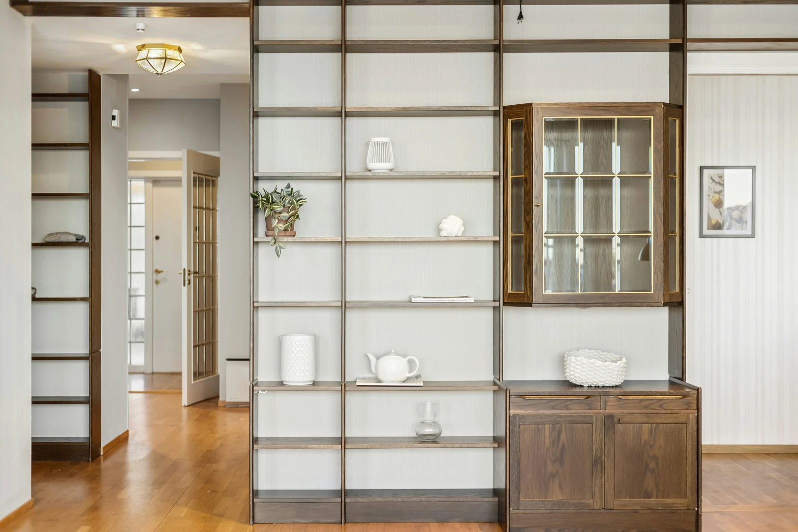
A Colour You Love Online May Behave Differently At Home
A sunny reference photograph cannot tell you how a paint will look beside your flooring on an overcast Vancouver afternoon. The room's exposure, nearby buildings, balcony overhang, glazing and lamps all form part of the colour decision.
Start with the surfaces you will keep. A floor, countertop or cabinet finish occupies a large part of the view and can make a subtle white appear warmer, cooler or less neutral by comparison. Choose a shortlist in relation to those materials, then test it where you will live with it.
The swatches and diagrams here help you compare ideas. They are not a substitute for a physical sample: screens, cameras and editing change colour, and a diagram cannot predict the exact appearance of a particular home.
What Direction Does The Room Face?
Benjamin Moore's exposure guidance distinguishes northern, southern, eastern and western light. Treat direction as a useful first clue. A north-facing window looking toward a reflective building is different from one shaded by trees, and an open-plan corner condo can receive more than one exposure.
North
Often steadier, indirect and cooler in character. Compare a softer warm white with a crisp white; neither is automatically the right choice. Check how much daylight actually reaches the wall.
South
Can receive stronger daylight over more of the day, subject to season and obstructions. A warm finish may feel more golden in sun. Review the shaded corners as well as the brightest wall.
East
Morning and later-day conditions differ. If you use the room for evening relaxation, its morning appearance should not make the whole decision. Observe it after the direct light has moved.
West
Can shift from muted morning light to stronger, warmer late-day light. Sample at the time you usually occupy the room, and check glare and shaded surfaces separately.
Original lighting concepts, not calibrated room simulations. Window orientation alone does not predict a paint's exact colour.
Large Glazing Does Not Mean Uniform Light
A glazed living room can have a bright window wall and a much darker hallway or kitchen behind it. Nearby towers, tinted glazing, deep balconies and trees affect what enters the space. Observe the surfaces individually instead of assuming one sample beside the window represents the whole open plan.
Cloud cover can remove the direct-sun effect shown in a reference image. The practical Vancouver test is to include a cloudy day as well as any sunshine available. A colour should feel acceptable in the conditions you commonly experience, not only at its most flattering moment.
The Same Colour Can Change Throughout The Day
Morning
Check the room's early light and shadows.
Midday
Compare near the window and farther inside.
Overcast Afternoon
Include the subdued daylight you may live with.
Warm Artificial Light
Use your normal evening lamps.
All four start from one generic neutral colour with illustrative light overlays. They show the principle of changing conditions; they are not four verified appearances of a named paint, nor a universal daily sequence for every exposure.
Use a sample large enough to judge the surface, rather than a tiny chip surrounded by the existing wall colour. If you use a movable painted board, compare it upright on different walls and beside the floor and trim. Follow the sample product's application and drying instructions.
“White” Is A Family Of Choices
Compare whites side by side rather than assuming their names tell you how they behave. Benjamin Moore groups Chantilly Lace among cooler whites in its white-colour guidance, while Simply White leans warmer. White Dove is another useful off-white comparison. These are candidates to sample, not universal recommendations.
White Dove
OC-17 · LRV 83.16
A softer off-white comparison when a very crisp white feels too sharp beside existing finishes.
Manufacturer colour pageSimply White
OC-117 · LRV 89.52
A warmer white candidate. Check it with existing creamy cabinetry and under your evening lighting.
Manufacturer colour pageChantilly Lace
OC-65 · LRV 90.04
A crisper comparison. Review it beside warmer floors and any retained trim before choosing a whole-room finish.
Manufacturer colour pageDigital swatch values and LRV are taken from the current manufacturer pages, reviewed October 3, 2026. Actual paint can differ from your screen. LRV describes light reflectance; it does not create daylight or guarantee that a room will look bright.
Undertone is especially useful as a comparison concept. A white that seems neutral alone may look creamier beside a cool countertop. A grey can look different next to reddish wood than next to pale stone. Avoid deciding on undertone from a screenshot or from a colour's name alone.
Judge The Paint Beside The Materials You Will Keep
Compare with honey, red or brown wood, warm metals and creamy stone.
Compare with grey floors, cooler stone and stainless finishes.
The wall colour is identical in these original illustrations. The surrounding materials change the comparison. These are generic palette concepts, not named paint or product samples.
Floors And Fixed Cabinetry
Place the sample close enough to see it with the actual floor. Test against kitchen doors, counters and backsplash together; one warm surface and one cool surface can create a more complicated choice than a single undertone category suggests.
If repainting cabinetry, colour is only one decision. Product suitability, preparation, adhesion and the finish's durability matter. Ask the manufacturer or painter about the actual surface and coating system. A wall-colour sample is not proof that the same sample product is appropriate for cabinet use.
Walls, Millwork And Feature Areas
Trim and wall sheen can change how light is reflected even when the colour name matches. Review the planned finishes together and test the intended product where appropriate. Existing bright-white millwork can make a newly painted wall look different by comparison.
A deeper feature colour may suit a niche, cabinet or room with a specific atmosphere, but consider every viewing angle in a compact open plan. A small dark area can become the focal point. Do not choose it solely because it is trending; decide whether it relates to the furniture and daily use.
Keep The Evening Lighting In The Decision
Compare the sample with the lamps and ceiling lights you normally use. Different bulb colour temperatures and colour-rendering characteristics can change the impression of paint and materials. One cool light over the kitchen and a warm lamp in the living area can make an open plan appear inconsistent.
If you intend to change the bulbs, make that choice before settling on paint. Test the new lighting first rather than painting to compensate for a temporary lamp. A warmer bulb does not necessarily make every cool colour look better; the whole palette needs to work together.
Photographs can conceal this difference because cameras and editing adjust white balance. Use room photographs to understand material relationships and mood, but rely on direct observation for your final colour decision.
A Sampling Routine That Gives You Useful Answers
- Choose a small shortlist. Compare a few distinct candidates instead of surrounding yourself with many almost-identical chips.
- Prepare representative samples. Follow the maker's instructions for coats, surface and drying; label the colour and product.
- Test near fixed finishes. Include flooring, cabinets, counters and existing trim.
- Move between walls. Compare the window area, shaded corner and connected hallway.
- Observe at several times. Include morning, midday, cloudy daylight when available and your normal evening lamps.
- Record the actual issue. Note “too creamy beside the counter at night” rather than simply “bad.”
- Confirm the intended finish. Review the product and sheen with the supplier or painter before ordering the full quantity.
A practical example: a condo owner likes a crisp white in a sunny reference image but finds it too stark beside retained warm cabinets on a cloudy afternoon. Testing a softer off-white may solve the relationship; buying the “Vancouver-friendly” colour without sampling would not answer that specific problem.
Room layout also changes what is visible together. The furniture-layout guide considers those sight lines, while the listing-photo guide explains why camera images should not replace an honest view of the room.
Manufacturer References
- Benjamin Moore: colour handbook and lighting
- Northern exposure
- Southern exposure
- Eastern exposure
- Western exposure and sampling
- White and off-white colour guidance
Featured photograph: Alex Tyson / Unsplash, under the Unsplash License. Its pale walls, warm floor and darker cabinet show why materials should be assessed together. The actual paint colour and location are not identified; it is not presented as a named Benjamin Moore application or a Spencer listing.
Preparing A Vancouver Home For Sale?
If you want to discuss which presentation updates are worth considering before listing, contact Spencer.